

SuperWorld
🌎 UI/UX Design Internship
🌎 Accessibility
🌎 Sitemap
Duration
Mar 2021 - Aug 2021
6 months
Role
UI/UX Design Intern
Mobile App Team
Tools
Adobe XD
Figma
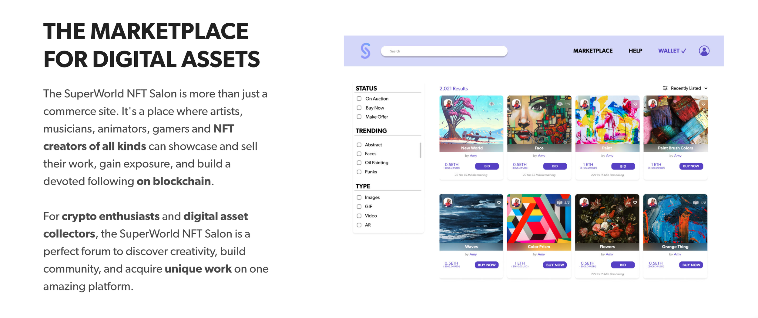
What is SuperWorld?
During spring and summer 2021, I had the amazing opportunity to intern for an innovative startup called SuperWorld!
SuperWorld is a virtual world where users can buy, sell and curate over 64 billion unique plots of virtual land. The SuperWorld virtual real estate platform is mapped over the entire surface of the globe, allowing users to purchase — literally — any place on earth.

At SuperWorld, I was part of the AR Mobile App Team. Alongside three other design interns, I created clean, functional screen that are user-friendly.
SuperWorld’s mobile app allows users to personalize their purchased world by using augmented reality. Users can create AR content like photos, videos, text, and animation to customize their space, as well as explore others’ creations.
During my time at SuperWorld, I completed four projects:
1) Adapting mobile app features for the new NFT marketplace
2) Reimagining the Object Select menu
3) Accessibility changes
4) Figma migration
Project 1: Adapting for the NFT Marketplace
Upon my arrival at SuperWorld, a new product was being launched: an NFT marketplace. Because of the new product, the mobile app team needed to add new features to accommodate and give access to those in the Marketplace.
So, what is an NFT?


A non-fungible token (NFT) is a digital asset that represents real-world objects, such as art, music, or videos. NFTs are bought and sold online with unique identifying codes that make them impossible to be interchangeable or replicated.
What needed to be changed on the app?
We needed to create designs for AR mobile app users to interact with NFT creators and their art. Using the mobile app, users should be able to view and buy NFTs to then later use in their AR creations.

User Flow
The first step to tackling these major changes was to visualize the features that would be changed, as well as the new interactions among these features. I proposed creating a simple user flow and took on this task. I later presented this flow to my design team, the mobile engineering team, and the AR team.
The user flow I created takes into account the interactions that need to be created between the NFT Discover page, "see more" pages, individual NFT pages, and the user profile
Discovering NFTs
At the time, there was no way to search exclusively for NFTs and their creators using the mobile app's search function. I designed a new set of screens to add this capability. I made several additional design improvements to the old design as well!
BEFORE
AFTER


→ Post grid layout still stayed the same on the ‘Top’ page!
→ Why change from a picture grid to cards?
→ NFTs are pieces of art, and a card makes it look more like a purchasable item rather than a picture of something. This design for NFTs also matched the corresponding design in the Marketplace.
more breathing room
more profiles
New NFT tab
‘See More’ Designs
CREATORS
CREATIONS


→ Vertical scrolling mechanism for additional profiles
In what fashion will the items in 'see more' be presented...vertically, horizontally, in individual cards?
→ Vertical Scrolling mechanism for additional NFTs
Individual NFTs
As a team, we now needed to brainstorm what kind of information to include for each individual NFT when it's clicked on in the screens above. What kind of information would be useful to both NFT creators and typical users of the mobile app?
To determine what information to include on this page, our design team had consulted three stakeholder groups:
1) NFT creators
2) Mobile app users
3) The NFT Marketplace design team


NFT Creators
Mobile App Users
Marketplace Design Team
Our team discussed with a dozen NFT creators that are currently working with Superworld and contributing their NFT art. Because of non-disclosure reasons, I cannot reveal specifics of the conversation, however, our team's conclusions after meeting with them are that the creators value 1) their art being showcased as their art first and 2) publicity with regard to their art collection.
The user of the mobile app would be the individuals purchasing or using the NFTs and exploring various NFT creators. Our team discussed with a dozen of our users to discover what kind of information would be helpful for them when exploring both NFT artists and their creations. We also posed some words to them, such as "AR", "Asset", and "Art", to understand what type of language we should use when referencing NFTs.
Finally, we wanted to consult the NFT Marketplace's design team to get accustomed to some of the information that we must include on the screens about to be created, such as price, NFT image, creator, etc. We learned from the experts!
With this information, a fellow design intern and I worked on creating screens for both free and priced NFTs:
FREE NFT
PRICED NFT


NFT creator
number of in-app users
displaying the artist's name. There's no "owner" for the NFT because it's free
Users of the mobile app indicated that they'd like to be able to "see said NFT in action", so we created an AR Used In section. Users also indicated that "AR" is a term they're comfortable with.
Priced NFT screen is very similar, except it includes an owner plus a 'see more' section
price

Zooming in!
I also solely created a zoom in feature when the user clicks the NFT image
→
NFT Profiles
Finally, we needed to add an NFT tab in the profile that contains the user's NFT creations and their collection of NFTs, which I was tasked with. This task was very fun and a bit challenging because I had to figure out how to differentiate created NFTs from collected NFTs in an intuitive way.
Let’s start with the icon!

This was some of my inspiration for the new NFT icon! I wanted to make a symbol that's pretty well-known in the industry and that's easily recognizable by users.
This is what I came up with:
unselected
selected
Initial Design (using a previous iteration of the NFT icon)


I created a micro-animation in which the Created and Collected NFT tabs were hidden within a vertical dropdown.
Blur when dropdown opens so the dropdown options are what's in the user's focus
The animation above was not implemented…WHY?
Although the animation above was the ideal solution here as decided by both the design and dev teams, the Unity package the dev teams were using at the time didn't support quite smooth an animation. Because of this, I created an alternative design for the profile, which ended up being the final one:

alternative profile design
Project 2: Reimagining the Object Select Menu
In the SuperWorld mobile app, users can select objects (and now, NFTs), to use within their AR creations. Our past Object select process was a bit confusing for the user, so I set out to make some upgrades to it.
How can we improve the existing interface?

BEFORE

AFTER
user testing done prior to my time at Superworld indicated that 'objects' wasn't a clear enough term
In this old design, the user could only see two rows of assets at a time, forcing them to scroll further down to see more assets.
Three rows of assets instead of two
‘Objects’ renamed to ‘Assets’
Why the copyright symbol?
There are certain assets which are created by external artists, and they need to be identified as such.
Is it time to add new features?
At this time, the product and development teams were ready to make some big changes to the object select process. I was the sole designer in charge of creating designs for these major changes, and while I was a bit intimidated at first, I found this to be a great opportunity!
Change 1: Multiple types of assets can now be used in a user’s creation
Previously, assets in the creation process were limited to 3D Objects provided by Superworld. Due to the NFT marketplace and the product vision for the company, we were now including various asset types, including Owned NFTs, GIFs, Effects, Videos, and Audio!
What changes did I make?
I needed to find a place to create a dropdown for the asset select menu. I went through 3 iterations till I found what our team decided to be the best solution:

This is the screen I was working with to fit in a dropdown menu. It was a bit difficult because the screen already had so much going on, but I managed to make it work through 3 iterations!
3 Iterations: Dropdown
1st: Dropdown below search bar

2nd: Dropdown above search bar

3rd: Dynamic Animation

This design was not ideal because placing the dropdown below the search bar 1) threw off the balance of the screen and 2) pushed down the other elements.
Although this iteration fixed the two problems from the first, the search bar was now partly covered
The best solution here was an animation that shortened/lengthened the search bar depending on whether the user wanted to search for an asset or navigate to a group of assets.
Change 2: Now that different types of assets can be used, how do we differentiate between them when the user selects to view 'All Assets'?
Users now have the option of selecting to view all the assets using the dropdown.
What changes did I make?
I made sure to include all the asset's pertinent information when the user looks at all the assets combined.

the information I included about each asset includes the name of the asset, type, and creator
Project 3: Accessibility
Along with 2 other design interns, I tackled the task of making the product more accessible. In this process, we specifically followed WCAG, a set of accessibility guidelines that's used heavily in industry and at Superworld.
During this project, I was tasked with focusing on visually-impaired individuals.
As part of this, I dealt with manipulating color contrast and icons to best cater to those who have low-vision or are colorblind.
Bad Password Page
We had an existing design for when the user enters an incorrect password as they're trying to log into Superworld. I had another look at this design and came to the conclusion that it might cause some problems for those who are visually impaired, so I changed it:


BEFORE
AFTER
This red color does not pass the WCAG color contrast guidelines ->
<- Red indicates that an error has occurred, but how can we make it easier for colorblind people to quickly see that something's wrong without reading the message?
<- I changed the color to be a more brownish-red for readability. I also added an icon that's easily recognizable as a warning sign -- doesn't require color to recognize
Post Pop-up
We also had another existing design for when users click on another user's post in the map feature. Parts of this design weren't passing the accessibility contrast check either, so I changed the design accordingly:


BEFORE
AFTER
The type of location and walking distance is unreadable against a white background ->
The change in color I made makes the text more readable ->
Project 4: Figma Sitemap
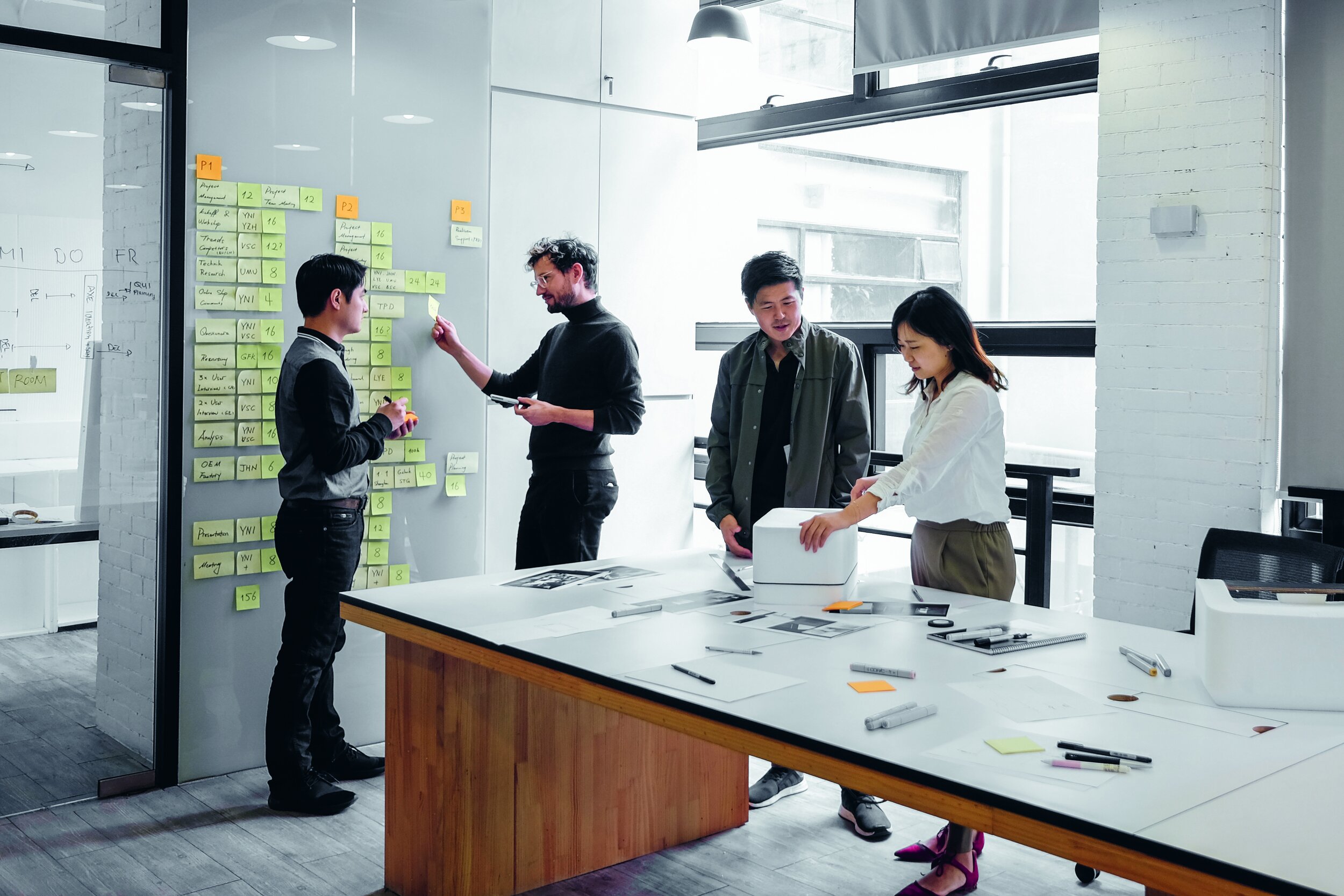
Towards the end of my internship at Superworld, in the last month or so, our design team spent about 2 weeks migrating from Adobe XD to Figma. As part of this process, we created a sitemap to help both us and the developers keep track of new and existing features + their status within the product.
My role was to create the Search and AR Creation portions of the sitemap.
Sitemap Key
First, our team created a sitemap key for us to identify various elements in the map. Note that some of the language we used is geared more toward developers, since they'll also be using the sitemap, ie. If scenario

Sitemap: Search
The Search Portion of the sitemap wasn't too complex, since the feature itself doesn't have many moving parts. This portion of the sitemap involved various smaller features and CTAs.

Sitemap: AR Creation
The AR Creation portion of the sitemap, however, was much more complex. When first joining Superworld, the AR Creation process took me the longest to understand, so creating this sitemap was a good challenge for me. I'm very proud of the details I included! Below are some snapshots of parts of the AR Creation sitemap portion!


Reflecting on my time at SuperWorld
Interning at SuperWorld made what could've been the worst summer due to COVID-19, one of the best for me. I got the chance to explore so many more facets of design in detail, such as designing for accessibility in mind, creating complex micro-animations, and putting together sitemaps. I worked with such a lovely team of designers! I'm grateful to my fellow design interns for being so fun to work with. I'm also indebted to my product manager, Maddy Guinness, and my design team lead, Hanh Dang, for teaching me so much about the product design field. I can't wait to see what my design journey has in store for me next!