

VMware
PRODUCT DESIGN INTERNSHIP • CO-DESIGN • DATA VISUALIZATION
Designing seamless onboarding experiences for an analytics platform that enables developers to identify anomalous activity among their applications.
Project Context
• Product Design Internship • June 2022 - Sept 2022 • Team: Pamel Shinh, Ala Dewberry, Clemens Kolbitsch
Roles and Responsibilities
The Internship
Modern applications are under attack.
Process

Insights and Implications
Customers want a simple installation pathway that facilitates anomaly detection.

Sample Survey Questions
Results

Weeks 4-7
• Figma • Miro • Confluence • Notion

Weeks 8-12
During the Summer of 2022, I had the opportunity to intern as a Product Designer at VMware, a leading provider of enterprise multi-cloud services. I was part of VMware’s product innovation group known as xLabs, delivering ahead-of-roadmap innovation and cutting-edge technologies in collaboration with partners and customers.
My intern project focused on researching and designing an intuitive onboarding experience for an analytics platform from the ground-up. I have the pleasure to share details of my design process since Project Trinidad was announced at VMware Explore!

In a Snapshot…

Weeks 1-3
BACKGROUND
Applications, especially the ones we use day-to-day, are increasingly under attack. Existing, perimeter-based solutions are not sufficient to protect against subtle threats, like zero-day attacks, for example.
Project Trinidad is a security and analytics platform that protects against these niche cyberattacks. Trinidad leverages machine-learning models to learn normal East-West API traffic between microservices, enabling developers to detect and take action against of anomalous activity.
Primary Tools
• UX Research: Survey, Competitive Analysis, Stakeholder Elicitation, Personas, Customer Journey Mapping • UX Design: Sketching, Wireframing, Visual Design, Prototyping, Co-Design Workshop Planning
Define

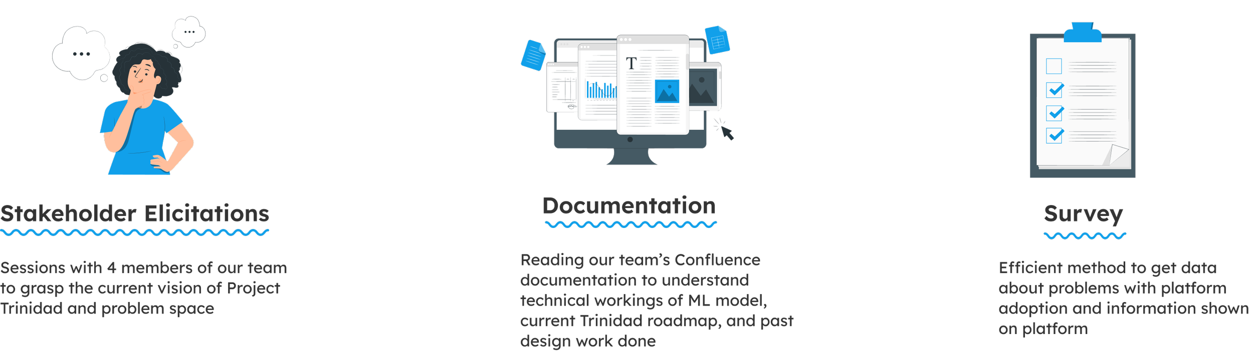
STAKEHOLDER ELICITATIONS
Showing the customer Trinidad’s value early on is key.
I held four different sessions with stakeholders within our team to elicit information about the product vision for the platform. Below are the individuals I interviewed:
Pamel Shinh, Lead Product Designer
Clemens Kolbitsch, Tech Lead
Dennis Ramdass, Engineering Manager
Ala Dewberry, Product Manager


SURVEY
After the elicitation sessions, I decided to deploy a survey using MS Forms to our team and adjacent ones to gather more pointed data related to the elicitation insights. I received approximately 40 survey responses.
Why have internal teams take the survey?
We were in a unique position in that individual developers at VMware would be likely to adopt Trinidad first. Thus, we wanted to gain input from them first since they were most accessible and could provide us with quantitative data quickly.
What will make Project Trinidad successful for its customers?

Rate the importance of each type of data below from 1 to 5:

Onboarding for existing platforms causes information overload and confusion.
My primary research during the Define stage drove my approach for competitive analysis. Based on insights from the elicitation sessions and survey, I decided to focus my analysis on the setup and onboarding pathway for two similar solutions in the market: Pixie and Wavefront.

Pixie
Putting it all Together…
PROTO-PERSONAS
A spectrum of interaction with Trinidad’s onboarding.
My competitive analysis involved conducting a website audit for each platform to identify onboarding strengths, weaknesses, and market opportunities for Project Trinidad.
Wavefront
Insights:
multiple entry points into one installation guide may cause confusion for first-time customer
step-by-step textual instructions for this problem space are clearest
several aspects of the onboarding and guide would likely lead to information overload
HOW-MIGHT-WE
Armed with findings from the survey and competitive analysis, I formulated a How-Might-We statement that guided the direction of our design process moving forward.
Insights:
use of flowcharts to show onboarding processes
subscription model explained through huge block of text - not skimmable
tutorials feel lengthy and not well integrated into the platform

Next, my mentor (Pamel) and I worked together to develop three proto-personas that reflected what I uncovered thus far. We framed these initial personas in the context of a customer using Trinidad for the first time.
Our personas encompass three varying levels of interaction with Trinidad:
• Hector, Security Analyst
• Shawna, DevOps
• Jane, App Developer

JOURNEY-MAPPING
From discovery to delivering value — where does onboarding fit in?
After presenting the personas to my team, I created the two journey maps below to visualize the following:
a) Journey Map #1: the overall journey for discovering Trinidad to Trinidad delivering value
b) Journey Map #2: a more micro-journey detailing how our personas could experience getting started with Trinidad through onboarding
Journey Map #1: Discovery to Delivering Value
• After I created this journey map, our team determined that Trinidad would best work with three subscription tiers: Self-hosted Free Trial, VMware Cloud Subscription, Enterprise
• Discovered that we may need to explore a VMware admin role for Enterprise users
Journey Map #2: Getting Started with Trinidad
• The distinction of a Manual Flow and Automatic Flow depending on the subscription tier and presence of additional persona VMware representative
• Enterprise tier users log in through VMware’s Cloud Subscription Portal (CSP)
• Security Analyst and DevOps personas have the most interaction with the onboarding process and experience the most pain points overall
CO-DESIGN
Ironing out the customer journey through collaborative co-design.
At this point in the design process, my mentor and I agreed that it would be very helpful to more closely involve cross-functional team members in refining our proto-personas and journey map before we jumped into the Design stage.
To do this, we developed a plan for a 3-hour co-design workshop with 20 members of our team and stakeholders from other teams that fell under our three proto-personas.

Workshop Outcomes
The co-design workshop had two main outcomes:
1) Deprioritizing the Security Analyst persona
After discussing the Getting Started journey during the workshop, we agreed that the Security Analyst persona would likely have little to no direct interaction with the Trinidad onboarding experience.
Thus, we decided to remove Hector as a persona and focus on the needs and pain points of our DevOps and Developer personas.
Workshop Goals:
• Align team understanding of major pain points, personas, and journey
• Involve stakeholders to enrich personas and journey
2) Further Iterating on the Onboarding Journey
Key additions in this iteration included the following:
• a focus on interactivity with the customer throughout the Discover and Use phases
• defined exact pre-requisites for the customer to use Free Trial tier (Kubernetes environment running on Linux, app with API traffic in their k8s cluster, cluster admin rights)
• During the workshop, we ideated ways to let the Free Trial customers have access to an application to quickly start identifying anomalies - we settled on providing a SockShop demo application for them to download during onboarding, so their actual applications don’t get affected immediately
COMPETITIVE ANALYSIS
Design

IDEATION
Converging on an interactive tutorial that delivers value quickly.
My mentor and I hosted 2-hour design sessions every week that we reserved for ideation exercises and making progress on designs. During these sessions, we engaged in ideation activities, including Brainstorming and Crazy 8’s.

Crazy 8’s
Our Crazy 8’s ideation was a bit more structured than usual - we each took a handful of starred ideas from Brainstorming that we were interested on visualizing and used those in the exercise.
Zooming into the installation pathway.
Brainstorming
We broke down our HMW into two parts to brainstorm on and identified several ideas to move forward with that address both parts of our problem statement including:
• An interactive tutorial guiding the customer through platform features
• Quick-start guide
• Showing example anomalies, alerts, and use cases
• Categorizing anomalies based on severity level
USER FLOW
With the ideas we wanted to incorporate into the onboarding experience and initial dashboard, I created a user flow to guide my understanding of how the customer navigates through the onboarding/installation experience and identify points in the experience that need further fleshing out.
ITERATIVE DESIGN
3 Iterations — a noticeable jump in learnability.
I led the iterative designing process after creating the flow of the onboarding experience. This involved 3 for each main feature, depending on feedback I received from the team and design considerations of my own.
Choosing a Subscription Tier
In the first iteration (sketch), each subscription tier was displayed on top of the previous one.
I changed this in the second iteration (lo-fi wireframe) to have the subscription tiers be side-by-side, so that opening up on the tiers wouldn’t require the user to scroll further on the page to change their desired tier.
In the final iteration (hi-fi), instead of having each step for the tier appear only upon the user clicking it, I displayed them automatically to remove a step for the user. Also, I changed the action to open up each tier to be a button click, which would be more intuitive for users.
Main Dashboard
The sketch included the most recent anomaly alert at the top, followed by the three most important pieces of data to our customers. Finally, customers can search for anomalies and find remediations in the anomaly table.
In the second iteration, a wireframe, I added the severity level and timestamp to the most recent anomaly alert, along with more details in the anomaly table.
In the hi-fi wireframe, I moved the recent alerts section to the side of the page to allow for multiple alerts to be shown. I also included a visualization showing anomalies by severity. Finally, I moved the search bar inside the table to make it clear that searching would be for anomalies within the table and for nothing else on the dashboard.
Interactive Tutorial
The first iteration shows an anomaly alert popping up and the tutorial then prompting the customer to interact with the alert.
The wireframe iteration is similar to the sketch but also shows the dashboard in the background as grayed out to draw the user’s attention to the anomaly alert.
The hi-fidelity mockup includes more details in the tutorial pop-up to humanize the experience and make it feel more personal to the customer.
DESIGN SYSTEM
Clarity, a design system guided by precision.
Prior to creating a hi-fidelity prototype, I read up on Clarity Design, VMware’s open-source design system, to understand what design language and components I had at my disposal to create a seamless onboarding experience for Trinidad. I specifically looked at the guidelines for building an intuitive onboarding experience for new customers, such as welcoming the user and guiding them through key tasks, and incorporated them into my design.
FINAL SOLUTION
A simple, intuitive onboarding pathway.
At the end of my internship, I produced a final hi-fidelity prototype to encompass the research and design work during my 12 weeks at VMware. I presented my project and final solution to 50+ people, including VMware UX leaders across several teams.
Informative Subscription Tiers
• Platform’s home page contains information about the three subscription tiers available
• Information is digestible and easy to read
• Differences between the tiers are easily identifiable
Step-by-Step Installation Instructions
• Installation guide is split into three digestible portions: Validating Pre-requisites, Deploying Trinidad, and Accessing Trinidad
• Tooltips included for extra guidance and information
• Each step includes relevant external links for more documentation
• Direct code snippets to copy-paste into the customer’s own Terminal for platform installation
Interactive Tutorial Walkthrough
• Design “spotlights” the key features of the Trinidad dashboard, including the statistics, anomalies over time, anomaly table, and anomaly alerts
• Tutorial shows an anomaly occurring in real-time through the Demo App SockShop
• Customer can skip the tutorial and view it anytime from the navigation bar
TAKEAWAYS
Reflecting on my time at VMware.

Being comfortable with ambiguity.
At xLabs VMware, requirements, constraints, and roadmaps were ever-changing. I learned that I should embrace ambiguity and do my best to formulate insights and design ideas from what I have at my disposal.

Designing for enterprise is messy.
Unlike what I was used to in course projects within UX, designing for enterprise software is even more non-linear. I found in my internship that design activities often happened in parallel, such as co-design, journey-mapping, and ideation.

Quick and dirty iterations is key.
At VMware, I became accustomed to continuously be ideating and iterating, even if the changes made were only small. I learned to effectively express my design ideas through quick means like a 10-second sketch.